The best artwork for custom cup carriers is a vector logo in one or two bold colors, sized to the panel of the carrier style you choose. Custom Cup Carriers accepts any file you have and sends a free mockup within 24 hours, so this guide covers file types, placement by style, paperboard versus pulp, and what to check before approving.
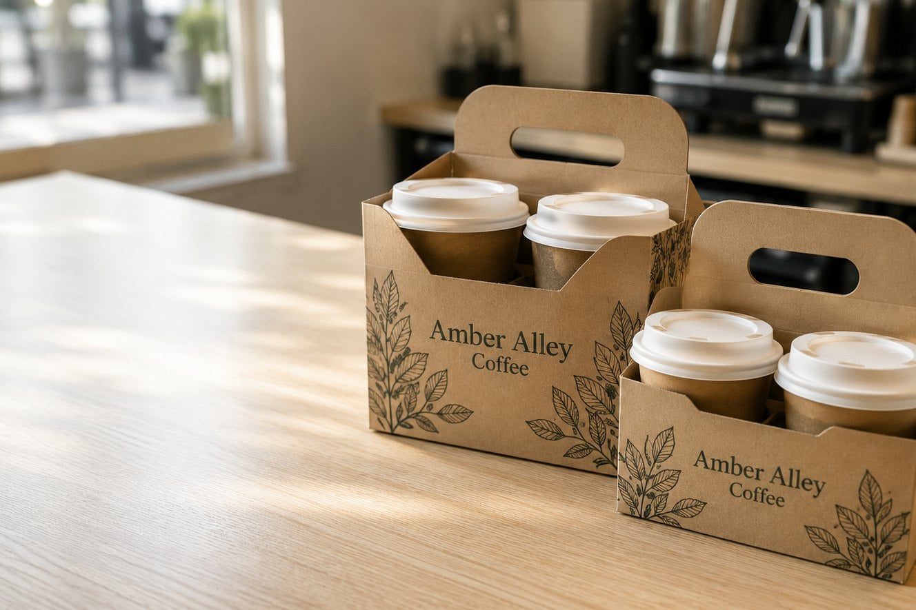
- Any logo file is accepted; vector files print sharpest
- Free mockup within 24 hours, unlimited free revisions
- Paperboard holds fine detail; molded pulp favors bold artwork
- Minimum order of 12 cup carriers
- Pay nothing until you approve the design
What artwork do you need to order custom cup carriers?
To order custom cup carriers you need one thing: your logo in the best file you have. Custom Cup Carriers accepts whatever you can send and returns a free digital mockup within 24 hours, so you never have to become a print expert before you request a quote. A clean vector file simply gets you to an approved design faster.
The ideal file is a vector format such as AI, EPS, SVG or a PDF exported from design software, because vector artwork scales to any carrier panel without blurring. A high-resolution PNG with a transparent background is the next best option. Screenshots, social media avatars and logos copied from a website usually need cleanup before they can print sharply on paperboard or molded pulp.
Beyond the logo, gather three supporting details before you open the quote form:
- Your brand colors. A hex code or a color reference from your brand guide helps the mockup match your cups, sleeves and signage.
- Any second line of text. A web address, ordering app name or catering line should be typed out exactly as it should print.
- The carrier style. Artwork placement depends on the carrier, so name the style even if you are still deciding between two.
How does artwork look on paperboard versus molded pulp cup carriers?
Artwork on paperboard cup carriers prints with crisper edges and finer detail, while artwork on molded pulp cup carriers reads best when it is bold and simple. The two materials have very different surfaces, so the same logo can need small adjustments depending on which carrier you choose.
Paperboard has a smooth, flat face. That makes a four-cup paperboard carrier or a two-cup clip carrier a good home for detailed marks, small taglines and multi-color logos. Molded pulp has a natural fiber texture and a shaped surface around the cup pockets, which softens fine lines. A molded pulp drink tray rewards a heavy wordmark or a solid icon over delicate script.
| Artwork element | Paperboard carriers | Molded pulp trays |
|---|---|---|
| Thin lines and script fonts | Usually hold up well | Thicken them or choose a bolder version |
| Small tagline text | Readable at modest sizes | Keep it short and larger |
| Multi-color logos | A strong fit | Simplify where possible |
| Solid icons and bold wordmarks | Excellent | Excellent |
If you order both materials, ask for a mockup on each. Seeing your logo on both surfaces side by side is the fastest way to decide whether one simplified version should serve both carriers.
Where does artwork go on each cup carrier style?
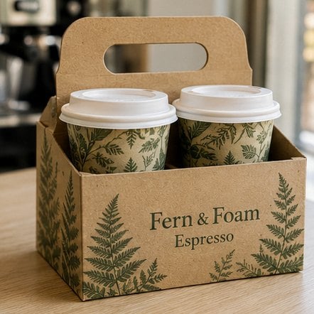
Artwork on cup carriers goes on the panels customers actually see while carrying drinks, and those panels differ by style. Your mockup from Custom Cup Carriers shows the exact placement, but knowing the general layout of each style helps you prepare a logo that fits.
- Two-cup clip carrier: a compact face between the cups, best for a single logo or a logo with one short line.
- Four-cup paperboard carrier: a central divider or upright panel that faces outward, with room for a logo and a web address.
- Handled cup caddy: side walls and the area near the handle, which sit at eye level as the customer walks out.
- Eight-cup catering tray: a larger surface that is seen from above on a conference table, suited to a wide logo and a catering message.
- Cup and snack combo tray: space around the snack compartment that stays visible once the drinks are lifted out.
Horizontal logos tend to fit long carrier panels better than stacked ones. If your brand has both a horizontal and a stacked version, send both files. The design team can then pick the version that fills each panel cleanly rather than shrinking one layout to fit an awkward space.
How many colors should cup carrier artwork use?
Cup carrier artwork usually works best with one or two colors, and a single strong color is often the most legible choice. Cup carriers are read in a quick glance from across a counter or a meeting table, so contrast and simplicity matter more than detail.
A one-color logo printed in a dark brand color on a natural paperboard or pulp background gives the cleanest result for most cafes, juice bars and caterers. Two colors work well when your logo genuinely depends on them, such as an icon in one color and a wordmark in another. Full-color artwork with gradients or photographs belongs on paperboard rather than pulp, and even there it should be checked carefully on the mockup.
Think about the carrier color too. A light logo on a light carrier disappears, so a white or pale logo needs a darker background area or a reversed version of the artwork. If your brand guide includes a one-color version of the logo, that file is usually the right starting point for cup carriers.
When you are unsure, ask for two mockups: one in a single color and one in full color. Free, unlimited revisions mean comparing options costs you nothing but a few minutes.
What should you check on a cup carrier mockup before you approve it?
Check every word, the logo version, the colors and the placement on your cup carrier mockup before you approve it, because approval is what starts production. Custom Cup Carriers lets you request unlimited free revisions and charges nothing until you sign off, so take the review seriously rather than rushing through it.
- Spelling and text. Read the web address, handle and tagline letter by letter. Typos in URLs are the most common artwork error.
- Logo version. Confirm it is your current logo, not an older file from a past rebrand.
- Color. Compare the mockup colors to your cups or sleeves, and remember that screens vary, so a brand color reference helps.
- Size and balance. Make sure the logo is large enough to read from a short distance and is not crowded by the cup pockets.
- Every style. If your order includes more than one carrier style, review the mockup for each one.
- Quantity and style. Confirm the count and carrier style on the order match what you planned.
A helpful habit is to show the mockup to someone who has not seen the design yet. A fresh reader spots a missing letter or a hard-to-read line much faster than the person who has looked at the file all week.
What are the most common artwork mistakes on custom cup carriers?
The most common artwork mistakes on custom cup carriers are low-resolution logos, too much text, weak contrast and details that go out of date. Each one is easy to avoid once you know to look for it, and most are caught on the free mockup if you review it closely.
- Low-resolution files. A small image pulled from a website prints soft. Send the original logo file or ask the design team to clean it up.
- Too much copy. Menus, hours and long slogans crowd the panel. Keep to the logo and one short line.
- Weak contrast. Pale colors on natural board lose impact. Choose a darker color or a reversed logo.
- Fine detail on pulp. Thin outlines and small type blur on textured molded pulp. Bold versions read better.
- Temporary details. Seasonal drink names, promo dates and old phone numbers age quickly while carriers sit in storage.
- Inconsistent branding. A carrier that does not match your cups and bags looks like an afterthought at pickup.
Timeless artwork also makes reorders effortless. When the design never needs to change, a repeat order of cup carriers is a quick confirmation instead of a new design project.
Can you use different artwork on different cup carriers in one order?
You can use different artwork across cup carrier styles in one order, and many businesses do. A shop might print its standard logo on everyday carriers and add a catering message to the larger trays that go to offices and events. Each version gets its own mockup, so you can approve them all before production starts.
Splitting artwork by style works well when the audience differs. Walk-in customers see a handled cup caddy on the way to the car, while an eight-cup catering tray sits in front of an entire meeting. Event vendors often follow the same logic; the guide to cup carriers for festivals and outdoor events covers sponsor marks and booth branding in more detail.
Keep the core logo consistent across every version so the brand stays recognizable, and change only the supporting line. The minimum order is 12 carriers, and the how it works page explains how mixed orders move from mockup to delivery in about 2 weeks.
Frequently asked questions
Does artwork print differently on molded pulp than on paperboard cup carriers?
Artwork prints differently on cup carriers made from molded pulp because the fiber surface is textured and shaped, while paperboard is smooth and flat. Paperboard holds fine lines, small text and multi-color logos well. Molded pulp favors bold wordmarks and solid icons. Custom Cup Carriers can show your logo on both materials in free mockups so you can compare before approving.
Can thin lines and small text survive printing on cup carriers?
Thin lines and small text usually print well on paperboard cup carriers, which have a smooth face that holds detail. On molded pulp trays, fine strokes and tiny type can soften because of the fiber texture. If your logo relies on delicate script, choose a bolder version for pulp, or keep the detailed version for paperboard styles only.
How should a white or light-colored logo be prepared for cup carrier printing?
A white or light-colored logo on cup carriers needs a darker area behind it, or a reversed version printed in a dark brand color. Light ink on natural paperboard or pulp often loses contrast and becomes hard to read. Send every logo variation you have, and the Custom Cup Carriers design team will suggest the version that reads clearly on your chosen carrier.
Can I match an exact brand color on custom cup carriers?
Brand colors on custom cup carriers come closest when you share a hex code or a color reference from your brand guide with your quote. The free mockup shows the planned color, but screens vary, so compare it against your printed cups or sleeves. Material also affects the final look, since natural pulp and paperboard each shift ink color slightly.
What should I check on a cup carrier mockup before approving it?
Before approving a cup carrier mockup, read every word letter by letter, confirm the logo is your current version, compare the colors with your other packaging, and check that the logo is large enough to read. Review each carrier style in the order separately. Custom Cup Carriers offers unlimited free revisions, and you pay nothing until you approve the design.
Can one cup carrier order include several different artwork versions?
One cup carrier order can include different artwork versions across styles, such as a plain logo on two-cup clip carriers and a catering message on eight-cup trays. Each version receives its own free mockup within 24 hours. Keep the core logo identical across versions so customers instantly recognize the brand, and change only the supporting line of text.
Will photos or gradient artwork work on cup carriers?
Photos and gradients can work on paperboard cup carriers, but they are rarely the best choice for a carrier that customers read in a quick glance. On textured molded pulp, gradients and photo detail tend to look muddy. Most businesses get stronger results with a solid logo and one short line. Custom Cup Carriers can mock up both approaches for comparison.
Can I reuse my approved cup carrier artwork on a different carrier style later?
Approved cup carrier artwork can usually be reused on another style later, though placement may change because each carrier has differently shaped panels. A logo sized for a four-cup paperboard carrier might need resizing for a handled cup caddy or molded pulp tray. Mention the original order when you request a quote, and Custom Cup Carriers will prepare a new mockup.
How many colors should my cup carrier artwork use?
Cup carrier artwork reads best with one or two colors, and a single dark brand color on a natural background is the most legible option for most shops. Use two colors only when your logo truly depends on them. Full-color designs fit paperboard better than molded pulp. Requesting one-color and full-color mockups side by side is free and quick.
Should a horizontal or stacked logo be used on cup carriers?
Horizontal logos usually fit cup carriers better because most carrier panels are wider than they are tall, especially on four-cup carriers and eight-cup catering trays. Stacked logos can suit compact faces like a two-cup clip carrier. Send both versions if your brand has them, and Custom Cup Carriers will place whichever one fills each panel most cleanly.
What text besides a logo belongs on custom cup carriers?
Custom cup carriers work best with the logo plus one short supporting line, such as a web address, an ordering app name or a catering note aimed at offices. Avoid hours, full menus, promo dates and seasonal drink names, because carriers often sit in storage for weeks and those details go out of date before the stock runs out.
Get a free mockup for your cup carriers
Send your logo or idea and the quantity you have in mind. Custom Cup Carriers returns a free mockup within 24 hours, you approve the design before anything is produced, and standard turnaround is about two weeks with faster options available. Get a custom quote.